What Makes a High-Converting Homepage? A Small Business Guide for 2026

July 6, 2026

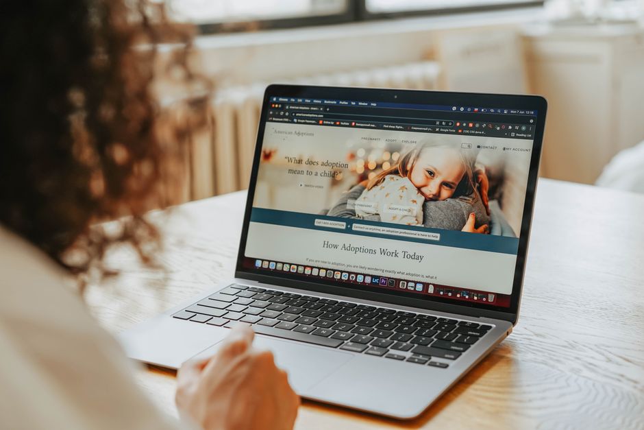
A visitor viewing a business homepage on screen

Why Your Homepage Decides Whether Visitors Stay

Your homepage is the hardest-working page on your website. It is usually the first thing a potential customer sees, and research suggests you have only around five seconds to convince them they are in the right place. Waste those seconds and they simply hit the back button, often never to return.

A high-converting homepage does one job brilliantly: it turns curious visitors into enquiries, calls and sales. It is not about winning design awards or cramming in every clever feature; it is about clarity, trust and gently guiding people towards a single, obvious next step that helps your business grow.

In this guide we walk through what actually makes a homepage convert in 2026, from your headline and layout to trust signals, copy and page speed. Get these fundamentals right and your website starts earning its keep, working as a genuine salesperson rather than an expensive online brochure.

Lead With a Clear, Benefit-Led Value Proposition

The single biggest factor in a high-converting homepage is clarity above the fold — the part visitors see before scrolling. Within seconds they need to understand who you are, what you do, and why it matters to them. A vague slogan or a pretty image with no message is one of the most common and costly mistakes we see.

Lead with a strong, benefit-led headline that speaks to the outcome your customer wants, not the features you are proud of. “We help Welsh trades businesses get booked out” beats “Welcome to our website” every time. Support it with a short sub-headline and one prominent call-to-action button so the next step is impossible to miss.

Getting this balance of message and design right is genuinely difficult, which is why it pays to plan it deliberately. Our web design team in Wales starts every project with the homepage message first, because a beautiful site that fails to explain its value will never convert, no matter how good it looks.

A clear signpost representing a strong value proposition

Design and Layout That Guides the Eye

Great homepage design is not decoration — it is direction. A high-converting homepage uses a clear visual hierarchy, leading the eye from headline to sub-headline to call-to-action in a natural order. Generous white space, a limited colour palette and consistent styling all help visitors focus rather than feel overwhelmed by choice.

Keep your main navigation simple, ideally to five or seven items, so people can find what they need without thinking hard. Remove anything that competes with your primary goal; every extra link, banner or pop-up is a small invitation to leave. The most persuasive homepages guide visitors towards one focused action, not five.

It is worth seeing these principles in practice on real projects that deliver results. Our case studies show how thoughtful layout and clear structure lift enquiries for small businesses, and they are a useful reference point when you are planning how your own homepage should be organised and prioritised.

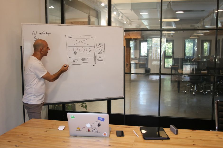
A designer planning a website layout and hierarchy
Customer reviews and star ratings shown as trust signals

Build Trust With Social Proof and Signals

People buy from businesses they trust, and a homepage full of unsupported claims does little to earn it. Trust signals are the evidence that reassures a cautious visitor they are making a safe choice. In 2026 they are more important than ever, as buyers research quickly and compare options before ever picking up the phone.

The strongest signals are genuine customer testimonials, star ratings, recognisable client logos and real results expressed as numbers. Add clear contact details, a physical address if you have one, and any relevant accreditations or guarantees. Authentic reviews and testimonial videos consistently outperform polished marketing claims for service-based businesses.

Place a few of these proof points high on the page, near your call-to-action, where they can quietly do their work at the moment of decision. You do not need dozens; two or three credible, specific examples reassure far more effectively than a long wall of generic five-star quotes that all sound the same.

Write Copy That Speaks to Your Customer

Design draws people in, but words are what persuade them to act. High-converting homepage copy is written for the customer, not about your business. Speak to their problem, describe the outcome they want, and keep the language plain and human. Short sentences, everyday words and a confident, friendly tone almost always outperform corporate jargon.

Focus on benefits before features. Customers rarely care that you use a particular process; they care that it saves them time, money or stress. Break text into scannable chunks with clear sub-headings, because most visitors skim rather than read. Every section should move them a little closer to contacting you or making a purchase.

Well-written homepage copy also supports your search visibility, helping the right people find you in the first place. If you want your words to convert readers and rank in Google, our SEO team can help you strike that balance so your homepage works hard for both people and search engines alike.

A copywriter drafting homepage content

Speed, Mobile and Technical Performance

You can craft the perfect message and still lose visitors if your homepage loads slowly. In 2026 people expect a page to appear in under two seconds, and every extra moment of delay pushes your bounce rate up and your conversions down. Speed is no longer a nice-to-have; it is a core conversion factor in its own right.

Optimise your images, choose reliable hosting and keep the page lean to load quickly on every device. The majority of visitors now arrive on a phone, so a mobile-first design with tappable buttons, readable text and a form that is easy to complete on a small screen is essential rather than optional for a modern homepage.

Accessibility matters too: good colour contrast and clear structure help every visitor, and search engines reward it. Getting the technical foundations right takes some know-how, so if performance is holding you back, our team is always happy to take a look and tell you honestly what is worth fixing first.

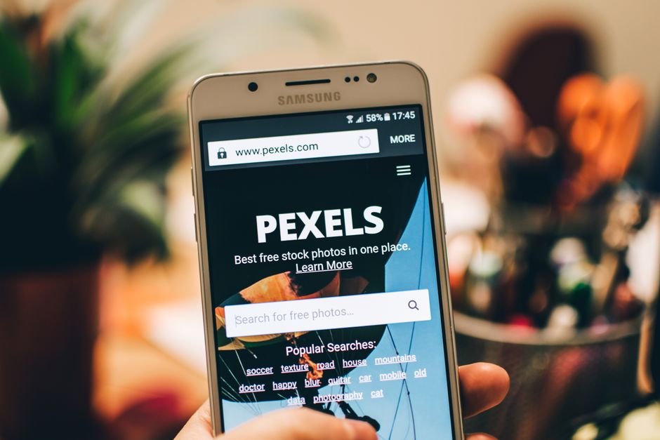
A fast-loading homepage viewed on a mobile phone
A small business team reviewing their website homepage

Turning Your Homepage Into Your Best Salesperson

A high-converting homepage is never the result of one clever trick. It is the sum of small, deliberate decisions: a clear value proposition, a layout that guides the eye, genuine trust signals, persuasive copy and fast, reliable performance. Get these fundamentals working together and your homepage quietly sells for you around the clock.

The best homepages are also never truly finished. Test different headlines, calls-to-action and layouts, watch how visitors behave, and refine based on real evidence rather than guesswork. Even modest, ongoing improvements compound over time, and businesses that test their homepages regularly routinely report meaningful uplifts in enquiries and sales.

At Primedia we design homepages built to convert, not just to look good, grounding every choice in what actually turns visitors into customers. If your website is not pulling its weight, our team would be glad to review it with you and help you build a homepage that genuinely grows your business.

A business owner considering how to improve their homepage

Frequently Asked Questions

What makes a homepage high-converting?

A high-converting homepage combines a clear, benefit-led value proposition above the fold, a clean layout that guides the eye to one main call-to-action, genuine trust signals like reviews and results, persuasive customer-focused copy, and fast performance on every device. Together these turn visitors into enquiries rather than simply informing them.

Research suggests you have roughly five seconds before a visitor decides whether to stay or leave. In that time your homepage needs to communicate who you are, what you do, and why it matters to them. A clear headline and an obvious next step are essential to hold their attention.

Focus on one primary call-to-action, repeated where it feels natural as visitors scroll. Offering too many competing choices splits attention and lowers conversions. A single, clear next step, such as "Get a free quote" or "Book a call", guides visitors and makes the desired action impossible to miss.

Yes, significantly. Most visitors expect a page to load in under two seconds, and every extra moment of delay increases the chance they leave before it appears. Slow pages raise bounce rates and lower conversions, so optimising images, hosting and code is one of the most valuable improvements you can make.

Not always a full redesign. Often clearer messaging, stronger trust signals and a single focused call-to-action lift conversions without rebuilding the site. Start by testing small changes and measuring the results. If the underlying design or performance is fundamentally holding you back, a redesign may then be the better investment.

Share:

Facebook
X
LinkedIn

Related articles: