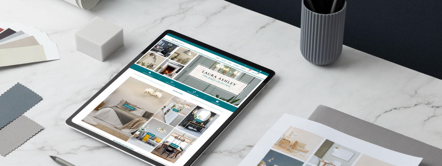
Sending paid ad traffic to your home page is a waste of money. You need dedicated landing pages that are laser-focused on one single goal: conversion. We design and build high-performance landing pages that remove distractions and persuade visitors to take action. Just like this one!
1. Persuasive Copywriting
We don’t just design; we write. We craft headlines that hook the reader immediately. We focus on benefits, not features, addressing your customer’s pain points directly. We use psychological triggers like scarcity and social proof to nudge the user towards the ‘Buy’ button.
2. Conversion Design
Every pixel serves a purpose. We remove navigation bars and distractions that cause users to leak away. We use directional cues (like arrows and eye gaze) to guide attention to your form or CTA. We design specifically to increase your Return on Ad Spend (ROAS).
3. A/B Testing Ready
We build pages that are easy to clone and modify. This allows you to run A/B tests (e.g., testing a green button vs. a red button) to scientifically prove which version makes you more money. We help you iterate towards the perfect conversion rate.
Lower your Cost Per Lead.
A better landing page means you pay less for every lead you acquire. By increasing your conversion rate from 2% to 4%, you effectively double your leads for the same ad spend. Our landing pages pay for themselves by making your Google and Facebook ads significantly more efficient.
Fast Loading
Ad clicks on mobile are impatient. We strip out heavy code to ensure your landing page loads instantly, reducing bounce rates from paid traffic.
Mobile First
We design for the thumb. We ensure forms are easy to fill out and buttons are easy to tap on mobile devices, where most social traffic comes from.
CRM Integration
We connect your forms directly to your CRM (like HubSpot or Mailchimp). Leads are injected automatically, allowing your sales team to follow up instantly.
Trust Signals
We strategically place testimonials, trust badges, and guarantee icons near the purchase button to reduce anxiety and increase confidence.